Showing posts with label layout. Show all posts

PageMaps | November goodness...

Good morning crafty friends!

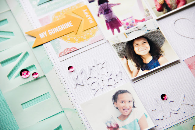
I'm am super happy about this months layout sketch and digital cut files! First off, cut files from The Cut Shoppe by Ashley Horton are fantastic. so much to choose from in a huge variety of design styles. Loved being able to create with her creations. And of course, PageMaps November sketch layout is so awesome, perfect for what I had in mind. Plus, I can never get enough of grids, yes!


For my project, I used the Get Your Grid On and Say Anything digital cut files; perfect for the sketch layout I selected. I loved the theme of the grid file tons... since I'm addicted to Instagram. My layout is all about my little girl with images of her I've shared on my Instagram feed over the past year or two. Always fun seeing your kids personality shine through and I loved the ones I used for her page. I also used some a-ma-zing Summer Red Raspberry Soup papers and embellishments by Jillibean Soup. Super cute paper and I especially love their alphabet vellum and stickers. Perfect accents to go along with my layout theme.


Thanks so much for stopping by... be sure to check out Ashley's The Cut Shoppe. You'll find a lot of awesome designs to add to your next scrapbooking project... xo!

PageMaps | splish, splash, August...


Good morning! This months PageMaps sketch is a favorite because it involved circles! YES! They are the perfect accent shape and adds a great flow of movement, too. At first I was going to do the opposite of the sketch design and create circle images for my background, but then I thought, wait, I have a lot of pretty embellishments by Pink Paislee, Heidi Swapp and Elle's Studio, to name a few.


I first punched out a variety of pattern papers to compliment the color palette in my photos and softened them up with vellum. Then embellishing each one with pieces that complimented the story/theme behind the photos and arranging them in a way that would grab attention. Used a dark blue archival pen to create the stitch accents around background and a few circles to balance out the dark blue photo mat that also holds my (oops, I messed up my writing) journaling and title treatment.


Be sure to check out the rest of the teams August projects. Thanks so much for stopping by... hope you enjoyed this months sketch layout. Have an awesome Sunday... until next time... xo!!!

PageMaps | she's so fancy...


Hello June! I'm getting exciting for summer with the kids home, to enjoy some lazy summer days, trips to the lake and the ocean and little adventures on our 2015 summer bucket list. One of my goals this summer is to use my camera more often than I have been. As I was finding inspiration for images to scrapbook this months sketch layout, I realized I have slacked off big time. There are memories I know I've not captured that should have been. But no, I was too lazy. On the flip side, I have enjoyed being in the moment without camera in hand. So, this summer, my goal will be to balance it all out being in the moment while capture our life behind the lens.


That said, these images of baby girl and daddy are my favorites thus far. It was a last minute decision she decided to attend her school Father & Daughter Dance. Luckily, I was able to convince Tim taking her and ordering her a wrist corsage... totally appropriate. I even bought her pink lipstick to match her pink and white corsage flowers.

I love this months PageMaps sketch a lot. There are so many ways to interpret the design for your own scrapbook layout. B&W images were appropriate for this page since I wanted the pastel like colors to pop with the geometric background and gold accents. I love how the overall look turned out. This sketch is sure going to be one of my go to sketches for future projects.

To complete my June sketch layout, I used GB's June kits, which were absolutely perfect for this layout. Totally swooned over the colors and all the pretty embellishments. Made creating this layout that much faster and easier. . Be sure to check out the rest of the team and contributors this months... there is a whole lot of inspiration for creating.


Thanks for stopping by... have an awesome week! Until next month... xo!

PageMaps | Easter approaches...


I just realized I am not prepared for Easter this year. Have no clue as to what our plans will be but I know I need to hurry and stock up on some eggs for the girl to begin coloring so she can enjoy hunting for eggs. I love that she is still into it... it's another way for her to be creative with her hands.


This months PageMaps layout sketch was a challenge for me. All the layering of various pattern papers was different for me, but I really enjoyed the idea of piecing it all together. As seen in the images, I used a very light, subtle background for the layouts foundation and piled on the patterns that I felt gave the page a cohesive look. Mixed up the title treatment a bit but kept it simple, allowing all the colors on this page to pop. And of course, I had to throw in a bit of gold!!!


Thanks so much for taking a peek at my project. Enjoy your weekend and have a wonderful Easter :)
...xo!

Gossamer Blue | she's so fab...


It's never a dull moment when one begins creating with an amazing kit from Gossamer Blue each month and the March kit was just that.... A M A Z I N G! Everything about the kit screamed spring with lots of soft pastel colors and bold embellishments to boot.

The "You Are So Rad." digital file made creating my main kit layout so easy and fast! I am not a fast scrapper, it takes me more than an hour to make a page... sometimes a few days. It really shouldn't take longer than an hour or two. But sometimes it just does, at least for me. I found these images of my girl last month and knew they were perfect for this page. I went with b&w since the original photo colors were bold. I love the soft background with b&w images anyway. Once I printed out the large title for my page and backed it up with the gold scripted pattern paper, the photos were anchored off to the side. I used very little embellishment to decorate the page, because I didn't want them to overwhelm the page. A definite fave layout by far!


If you haven't, be sure to pick up your kit TODAY, before they are all gone!!!! Thanks for stopping by. Hope you enjoy working with your Gossamer Blue kit as much as I did... xo!

Get It Scrapped | Product Play, true to style...

happy Monday!!!

i had the opportunity to participate in an online class session over at Get It Scrapped. the session is all about Product Play, giving the Get It Scrapped members inspiration and ideas for using new, trendy and older products while staying true to style. this was a really fun project to work on; it allowed me to use products i may not normally use and in different ways.

the first assignments was just that, create a layout using products while staying true to style. my true to style product for my Bon Appetite page is white cardstock! it has always been the main backdrop to most of my layouts. i love how it allows color to pop and lends a very clean and fresh appeal to any overall design. another true to style element is using the simple tone-on-tone technique; i do this in multiple ways. for this particular page, i used a series of clear white stickers from one package to set the tone for the rest of the design. i'm not a big fan of transparent alphabets, but i really like how it balances the subtle page design between the clear stickers and vellum elements.


Supplies used are from a variety of Gossamer Blue monthly kit club: | DIY Word Stickers by Simple Stories; DIY Clear Message Stickers by Simple Stories; Icicles Cool Sticker Charms by KI Memories; Enamel Dots by My Minds Eye; Soup Labels Sightseeing Stew by Jillibean Soup; Let’s Go Clear Alphabet Embellishments by Chic Tags; Let’s Go Tabs Embellishments by Chic Tags; Boy’s Rule Stars Vellum by Crate Paper; Font Calibri


the closeups gives you a better view of how the products look on the page. i really loved how the elements used are very subtle and feels somewhat calming, especially combined with the neutral tones from the images.

i'll share my other layouts created for this session in the coming days. as usual, thanks for stopping by :) xo... C!

Gossamer Blue | march projects...


guten tag! playing a little catch up today. it's another day and i have another layout, or two rather, to share with you! all using Gossamer Blue's March kits which have all sold out! YEAH! that's always exciting. the kits are so pretty! all the pinks and golds and silver tones a girl could ask for. i loved it and really enjoyed using all of it on my pages this month.


my first layout, "Lucky Me" using all products from this months main kit and digital cut files.i used my Cameo to cut out the rainbow and outlined it w/ the foiled twin. the gold clouds with raindrops added the perfect touch along side my title.


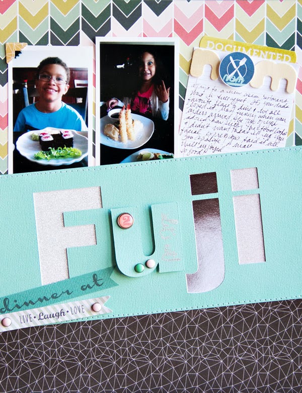
and finally, my second page, "Dinner at Fuji" uses a mix of goodness from add-ons and life pages kits... during one of our trips to Stamford, CT we enjoyed Asian fare at one of my husbands favorite places to eat. the food was so good and presented perfectly. the kids loved trying new things, which is always a plus!


thanks so much for stopping by, have a lovely day & stay warm... xo!

PageMaps | a new adventure...

happy Monday!! some exciting news to share...

first off, i love sketches and have been a fan of Becky Fleck's sketches for quite some time. i am completely over the moon excited to be joining the PageMaps team!! be sure to check out the March sketch gallery filled with loads of inspiration...

i pretty much followed the sketch but incorporated changes some of the details using certain elements to compliment the design. i replaced the journaling area with an envelop with the journaling peeking out and layered a single photo with stickers, 3x4 cards and texted background. all products used to are from Gossamer Blue's February and March kits...


thanks for stopping by... xo!!

gossamer blue | December project...

guten morgen!! i hope you had a wonderful Thanksgiving holiday and ate as much as you wanted. i know i did. hell, i enjoyed pecan pie three times on the big day and enjoyed a big slice of it for breakfast Friday morning, hahaha. and i did manage to fit in a trip or two to the gym :) this year i had not planned on shopping black Friday, but after seeing what the ads had to offer, i decided i needed to be amongst the chaos, haha. no camping out for me, but i did stand in line for two hours at a time at two different places and it was all worth it...

today, i have a layout share using the ever so fabulous Gossamer Blue December main kit... LOVE LOVE LOVE! i used a mix of everything the kit had to offer, die-cut files and printables. my vision for the design of this layout wasn't the original one. matter of fact, i redid the page entirely. i love how the layout turned out... though it's not generally my style, but nice to change things up a bit.


head on over to the shop and pick up your December kit today :) thanks so much for stopping by... have a lovely week :)


LB | digital die-cut freebie...

guten morgen! it's digital die-cut freebie day... but first, here is a layout i created for the Lily Bee blog today using one of my border strips i created that can be used with any die-cut machine...


the five different border strips you will receive in the free download...


please enjoy this free digital die-cut file... Fall Border Strips and visit the Lily Bee blog to read more about the project i created...

have a lovely day, xo...
Cindy Scraps. All rights reserved. © Maira Gall.