PageMaps | May, all stars...


Hello and happy May!

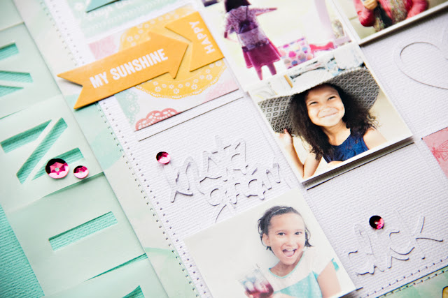
This months PageMaps layout is not your conventional "Mother's day" layout. As I was looking for pictures to create with the sketch, these images jumped out to me the most. My little ones candid approach to making the most of our outing brought back so many fond memories. I can never get enough of all the fun things we did together during our road trip to Stamford, CT and NYC. Moments like this don't come too often, but when they do, the kids and I take advantage of opportunities brought our way.

I was drawn to the stars placement on this months sketch. I grabbed my star punch and quickly put my layout together. I used a mix of colorful pattern papers, which cohesively complimented my photos color pallet. I kept the layout simple using strips of 6x1" strips to frame and set the background foundation. Everything else just feel perfectly into place.


Once again, thanks so much for stopping by... hope you're creatively inspired to document those special "moments" about being a mom.

xo, Cindy

April | Disney + Diamonds...


Hello and happy April Fool's day :)

Today's sketch layout is no joke, it's the real deal and I couldn't be any happier with PageMaps Aprils sketch design. Loved the diamonds so much, I went to down and used them as the basis of my page. There are layers upon layers of open and negative space going on with pops of color and texture. I used bits and pieces from a project life kit and added those elements to fill in the diamonds. I also took a sheet of Jillibean Soup letter stickers sheet because I wanted to through off the balance a bit with the yellow and contrasting text from my handwriting. I love how the layout turned out. I was nice to work with this bold shape. The photos were from our trip to Disney last summer. We had such a blast. I loved being there and celebrating a good time with my kids and mom. That trip holds so many memories I don't ever want to forget.


Thanks so much for stopping by. Be sure to check out the rest of the teams amazing sketch creations. Hope you get to spend a little time this weekend creating and documenting your favorite memories.

xo!

PageMaps | Hello December...


Can you believe it's already December and Christmas is just 3.5 weeks away? WOW, 2015 sure has flown by miraculously! Well, I don't know about you, but I am more than halfway done with my Christmas shopping. Super excited about that. Just a few more gifts to get and I'm good. But of course, that Christmas photo has yet to be snapped and now we just need to take a few moments our busy lives and get it done.

My December PageMaps sketch layout showcases our forever last minute Christmas card photo. How last minute? January 1, 2016 last minute. Yup, the day before all the holiday trimming were going to be boxed up, I grabbed the kids, Nala and festive holiday hats and snapped a few pictures and viola! It worked and was sent out to all our family and friends. Last year was an extremely, and unexpected busy time for us. But I didn't want to go without sending a little love and holiday cheer to our family and friends!


I kept with the color inspiration from my photo. Trimmed the main photo and phrase from our Christmas cards and used a mix of holiday elements that conveyed my themed layout. Love how it turned out, especially working with a unique layout sketch designed by Becky at PageMaps.


Thanks so much for stopping by this month. Wishing you and your family a lovely and happy Christmas... Cheers :)

PageMaps | November goodness...

Good morning crafty friends!

I'm am super happy about this months layout sketch and digital cut files! First off, cut files from The Cut Shoppe by Ashley Horton are fantastic. so much to choose from in a huge variety of design styles. Loved being able to create with her creations. And of course, PageMaps November sketch layout is so awesome, perfect for what I had in mind. Plus, I can never get enough of grids, yes!


For my project, I used the Get Your Grid On and Say Anything digital cut files; perfect for the sketch layout I selected. I loved the theme of the grid file tons... since I'm addicted to Instagram. My layout is all about my little girl with images of her I've shared on my Instagram feed over the past year or two. Always fun seeing your kids personality shine through and I loved the ones I used for her page. I also used some a-ma-zing Summer Red Raspberry Soup papers and embellishments by Jillibean Soup. Super cute paper and I especially love their alphabet vellum and stickers. Perfect accents to go along with my layout theme.


Thanks so much for stopping by... be sure to check out Ashley's The Cut Shoppe. You'll find a lot of awesome designs to add to your next scrapbooking project... xo!

PageMaps | halloween sketch layout...

HAPPY OCTOBER!

Super excited October is here, with milder weather and cozy nights. One of my favorite seasons, next to Spring. And as usual, I am looking forward to Halloween. I LOVE halloween, dressing up in costume, trick or treating with the kids and hanging out with friends. It's always so fun to see all the cool and spooky decorations and I love digging through the kids bag to grab my favorite treats.


The October PageMaps layout sketch was so much fun and I went back to basics with my page, mostly using cardstock only page. The lazy size of me was too lazy to go out shopping for current supplies. So, I decided to really dig deep and remember why I began scrapbooking in the first place. My page is pretty simple using similar elements shown in the sketch above.


I cut out my web using my Cameo silhouette machine and then used black embossing powder to give the web a bit of glistening action. Of course, I got carried away with the tone-on-tone affect with my page, which gives it a lot of pop against the white background.

Paper bats, halloween circle phrases and title treatment also die-cuts from the Cameo, which comes in handy. Yes, there was a bit of planning when putting this page together as far as sizing cut files, etc. The page uses very little hard embellishments, just a mix of black and orange enamel dots. Then I added the envelope on the side of the photo to hold journaling. Again, too lazy to pull out the sewing machine... so, I used the my trusty archival pen and t-ruler to frame the foundation page. Overall, I'm very pleased with the outcome.


Thanks so much for stopping by... hope you're inspired to create something fun and unique while keeping your elements simple. Happy Scrapping... xo!
Cindy Scraps. All rights reserved. © Maira Gall.